I. Understanding the Nature of the Data and Its Collection
The Global YouTube Statistics 2023 dataset provides comprehensive data on various YouTube channels. It describes their functionality, characteristics, and statistics from their respective broadcasting nations.
A. Information Description
The dataset contains information about specific YouTube channels, such as their:
- Names
- Subscriber count
- Total video views
- Category or niche
- Uploaded video count
- type (e.g., individual or brand).
The number of subscribers, views, country, and kind all go towards channel rankings. Data on the channels may be seen in Financial Insights. There are also the lowest and greatest anticipated monthly and yearly incomes. The quantity of video views is highlighted by data on recent channel activity. The channel’s launch date and metrics like the number of new subscribers in the last 30 days are also mentioned. These YouTube channels’ countries of origin’s socioeconomic data are also available. It includes information on the population, the unemployment rate, the urban population, the location, and the gross tertiary enrollment (%).
B. Data Collection Information
The YouTube API or web scraping are two ways to find out information about YouTube channels. To reflect changes in channel statistics, it can be adjusted. The financial information (monthly and yearly earnings) is approximated using readily available public information. This includes the anticipated earnings from advertising agreements or per-view estimates. Government agencies often gather and retain socio-economic data at the national level (e.g., population, unemployment rate, school enrollment). Data from international organizations or research institutions is sometimes collected. Latitude and longitude coordinates for countries are standardized geographical data. Geographic databases or mapping services could have proven useful.
II. Identifying the Target Audience for the Data
Many different types of users, each with their own unique goals and needs, may find the YouTube 2023 statistics dataset valuable and of interest. Consumers of such data often include: YouTube is used by people or organizations that produce content to gain an understanding of the marketplace. To plan, promote subscriber development, and increase income, they pinpoint the most profitable channels in their specialized market.
For possible collaborations and advertising campaigns, marketers and advertisers look for prominent YouTube channels and producers. They could also look at channel performance patterns to focus on demographics. Researchers and data analysts carry out in-depth examinations and investigations of internet content patterns. They research the effects of several variables on channel success. They also draw attention to correlations between socioeconomic factors and performance. Companies and brands interested in influencer marketing identify potential online influencers who align with their products or services. They then reach out to boost the engagement of such channels. Investors and financial analysts may find value in understanding the estimated earnings of popular YouTube channels. Especially those considering investments in the digital media and entertainment sectors.
These statistics come in handy in teaching and research by academics in media studies, marketing, and data analytics. They investigate trends in the production and consumption of internet material.
Professionals in the media and entertainment sectors may use the data to keep track of YouTube channels and possible partners, while policy analysts and representatives of governmental bodies can examine the socioeconomic effects of online content production on things like employment and education, among other things.
This dataset is beneficial for startups and business owners wishing to create their presence on YouTube. It enables the development of data-driven strategies.
III.Visualizing Data: Methods and Considerations
Metrics from the data are presented using the listed data visualization techniques.
A. Numerical data (subscribers, views, earnings)
The varied options of bar charts and line charts compare trends over time. Plot them between different YouTube channels or categories. For instance, a line chart shows the increase in subscribers for a certain channel over time. For displaying connections and correlations between numerical data, scatterplots are helpful. Use it to study how subscribers and monthly revenue for many channels relate to one another. Histograms show how numerical data is distributed.
B. Categorical Data (categories, types)
Pie charts work well for displaying how many categories or kinds are there in the dataset. Eg., channel category distribution. Bar graphs compare the numbers or frequencies of several categories. It compares the number of individual channels to brand channels.
C. Time-Series Data (channel creation date, recent activity)
Time series charts are excellent for visualizing how data points change over time. Illustrate the evolution of video views with it. Subscriber growth for specific channels over time is also suitable.
D. Geospatial Data (latitude, longitude)
A geospatial map with markers representing the countries of origin for YouTube channels would provide a visual aid. The marker size or color represents a relevant metric, like subscriber count or earnings.
E. Composite data (socio-economic indicators)
Heatmaps show how different factors are correlated. The relationship between socioeconomic indicators is shown through a heatmap. Eg. the unemployment rate, enrollment in schools, or YouTube channel success measures.
F. Text data (channel names, titles)
Word clouds have applications for textual data (channel names or video titles). They list the words or phrases occurring most frequently. Use it for information gathering about popular subjects or themes.
A dashboard combines different visualizations to allow for thorough analysis. For quick overviews, descriptive statistics, and summaries like mean, median, and standard deviation are helpful. Infographics present key insights succinctly.
IV. Key Insights Derived from Data Visualization
The visualizations mentioned earlier provide insights into various questions and topics from the YouTube 2023 Stats dataset. Here are a few examples:
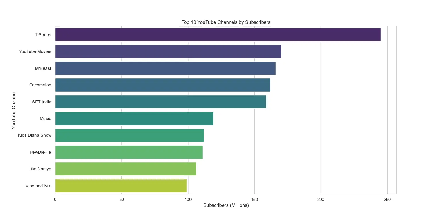
A. Top YouTube Channels by Subscribers (Bar Chart)
- Who has the most subscribers among YouTube channels?
- How do the top channels’ subscriber counts differ from one another?
- New channels that have recently racked up a sizable subscriber base?
B. Distribution of Channel Categories (Pie Chart)
- What are the most well-liked subcategories or markets on YouTube?
- How many channels fall into each category, on average?
- Categories that predominate on YouTube?
C. Earnings Analysis (Scatterplots or Line Charts)
- Is there a correlation between the number of subscribers and monthly earnings?
- How do earnings vary among channels with similar subscriber counts?
- Have there been any significant changes in earnings over time for specific channels?
D. Geospatial Visualization (Geospatial Maps)
- Where are the YouTube channels in the dataset primarily located?
- Any regional patterns or collections of profitable channels?
- Do popular YouTube creators tend to be more prevalent in some nations than others?
E. Trending Topics Over Time (Line Chart)
- How has the popularity of specific channel categories evolved over the years?
- Are there noticeable spikes in certain categories during periods?
- Can changes in category popularity be linked to global events or trends?
F. Channel Type Distribution (Pie Chart or Bar Chart)
- What proportion of YouTube channels are individual creators versus brands?
- Are there differences in subscriber counts or earnings between individual and brand channels?
- Has the distribution of channel types changed over time?
G. Correlation Analysis (Scatterplots or Heatmaps)
- Is there a correlation between a country’s unemployment rate and the success of YouTube channels originating from that country?
- Do countries with higher education enrollment percentages tend to have more popular YouTube channels?
- Can geographical location (latitude and longitude) be correlated with channel performance metrics?
H. Time-Series Data (Time-Series Line Charts)
- How has the number of videos uploaded by specific channels changed over time?
- What is the growth trend for subscribers or views for channels?
- Are there seasonal patterns in channel activity or viewership?
I. Text data (word clouds)
- What are the most common words or phrases in channel names or titles?
- Are there recurring themes or keywords that are associated with popular channels?
- Can we identify any naming trends within certain categories? These visualizations are versatile tools that allow data analysts, researchers, content creators, and other stakeholders to explore statistics related to YouTube channels. These often include performance, trends, and influencing factors. With the appropriate visualization techniques, it is easier to extract meaningful insights from complex datasets. These can be communicated effectively to a variety of audience types.
V. Avoiding Common Mistakes in Data Depiction
Common mistakes in data depiction led to misinterpretations. This lack of clarity in conveying the intended message has a negative impact. Incorrect visualization methods and ignoring data integrity and quality are some of the usual errors. Displaying incomplete data without indicating limitations is a must-avoid.
- Inappropriate data source
- Overcomplicating charts
- Manipulating scales, axes, or units incorrectly
- Failing to clean data
- Lacking clarity in labeling
Proper understanding requires clear labeling. Too many colors or a lack of a legend causes a negative association of data points with categories or variables. When non-spatial data is represented in three dimensions, data distortion occurs. The integrity and clarity of the data are compromised by misleading visual tricks. The issue with the paper-ink ratio results from using too much ink. A higher ratio suggests less clarity and visual clutter. It’s important to strike the right balance between simplicity and complexity. Visualizations that are simple and concentrate on the most important data points effectively communicate the message.
Another common error in visualizations is failing to tell a story. Explanations or stories should go along with visualizations. These annotations give the audience context and help them understand how to interpret the data. Deceptive and unethical manipulation techniques include changing the scale or axis intervals. Colorblind-unfriendly choices like inaccessible color schemes exclude a part of the audience. Reviewing and validating visualizations with colleagues or experts is a good idea to identify issues and improve the accuracy and effectiveness of data depiction.
- Plan and design visualizations
- Select appropriate chart types for the data
- Ensure data quality
- Focus on clarity and transparency
VI. Innovative Approaches to Data Visualization
In this approach, I would create an interactive dashboard divided into sections. Each will focus on a specific data type. Sections will be on channel performance, geographical distribution, category trends, and financial insights. To extract value from the dataset, I would assign data types to visual variables. E.g., numerical data like subscribers and views are encoded with spatial encoding through bar charts or line charts. Categorical data can be represented using color, shape, and other visual cues. Time-series line charts will showcase the evolution of subscribers or views over time. I will design geospatial maps that display the global distribution of channels. Heatmaps show the relationships between YouTube channel metrics and socioeconomic variables. I will use labels to distinguish channels and provide insightful information. Interactivity is essential for boosting user engagement. Users ought to have the option to filter the data, focus on time frames, or click on individual items to get additional in-depth information. Using brushing and connecting techniques, the dashboard analysis will be completed. Annotations and storytelling components provide users with context and direction. I’d organize a dashboard, give visual components a data type, and encourage user exploration. Making complicated data comprehensible and engaging requires clarity and coherence.
VII. Sample Visualization: Symbolic Representation in Action
VIII. The Process of Crafting Effective Visualizations
The Top 10 YouTube Channels by Subscribers graphic demonstrates the popularity of YouTube channels. Along the x-axis, there is a spatial encoding (position). This shows a quantitative measure’s range of values and numerical data (subscribers). The ideal graph to compare numerical values between categories is a bar chart. The graph has labels and titles for context and clarity. Contextual information is provided by a clear remark identifying the data’s source, constraints, or time frames.
This static example limits other perspectives. Interaction is not happening right now. The image displays the top YouTube channels in order of their number of subscribers. The relative popularity of these channels is revealed to visitors. Due to the use of location as the primary visual component, the chart accurately depicts the numerical data. Labeling and title give the necessary framework for interpretation.
IX. Exploring Alternative Symbolic Representations
The attributes of the dataset can be visualized using a scatterplot matrix with multiple scatterplots. This will provide a different symbolic representation compared to the one earlier. This approach is equivalent in the sense that it still allows for the visualization of relationships between pairs of variables. Yet it represents a different visual form compared to the previous dashboard-style visualization.
The scatterplot matrix is a visual tool used to represent numerical data. Subscribers, views, and earnings will be quantified in a grid-like format. Each pair of variables is represented in a separate scatterplot. The position of the data points represents the relationship between the two numerical variables. The scatterplot matrix is chosen as the appropriate chart type for visualizing these relationships. A grid-like arrangement of scatterplots is present. Each one has a label with the names of the variables and a caption describing the connection being shown. Context information may include data sources, restrictions, or periods. Users may zoom in or highlight certain data points by clicking on various scatterplots in an interactive scatterplot matrix. This is a far more thorough investigation of the connections between the variables.
Both the dashboard-style representation and the existing scatterplot matrix exhibit equivalence. In both styles, the position serves as the primary visual variable. While labels and captions provide context and clarity, it encrypts numerical data. The organization and presentation of the pictures vary amongst them, though. This alternative symbolic representation using a scatterplot matrix is equal. However, it has a different visual format that may be preferred for some analytical tasks. Eg. exploring pairwise relationships between numerical variables more methodically.
X. Impactful Visualizations with Assigned Data Types
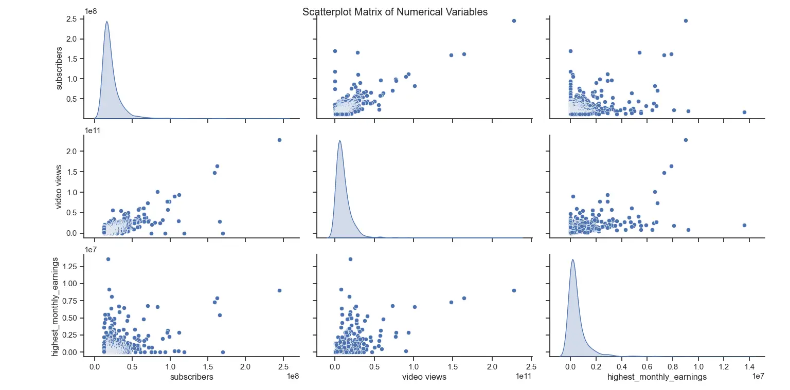
The scatterplot matrix visualization links numerical information to certain visual variables and axes. The visual variables are given a data type. For a visual investigation of the correlations between these variables, the image includes subscriptions, views, and revenue. The position, which represents a pair of numerical variables drawn on the x-axis and the other on the y-axis, is the main visual variable in scatterplots. The link between these two variables is encoded by the placement of data points in each scatterplot. Scatterplots are selected as the best style of chart for displaying relationships between pairs of numerical data because they may highlight patterns, trends, and correlations. Each scatterplot within the matrix has axis labels that mark the x-axis and y-axis with the names of the variables being shown. To describe the function of the visualization, the full scatterplot matrix is given the broad label “Scatterplot Matrix of Numerical Variables.”