
Introduction
ABC Private Limited, a retail company, aims to gain valuable insights into their customers’ purchasing habits. By analyzing the provided summary of high-volume product purchase history, which includes customer demographics and product details, ABC can uncover patterns and trends in customer spending across different product categories.
We will explore the analysis step-by-step using the test.csv and train.csv files. Through a combination of theoretical explanations and practical demonstrations, we will delve into data preprocessing, exploratory data analysis, feature engineering, and model building. We will be utilizing the power of Python for conducting Exploratory Data Analysis, performing data visualization, and training machine learning models. It is recommended to follow along using a Jupyter Notebook, as it provides an interactive and user-friendly environment for code execution and documentation.
Learn to deploy confidently with this guide on Netlify CI/CD
To proceed with the analysis, we will make use of various Python libraries, including:
- pandas: for data manipulation and analysis
- matplotlib: data visualization
- scikit-learn: evaluating and training machine learning models
- numpy: numerical computations
- seaborn: enhanced data visualization
- xgboost: implementing gradient boosting algorithms
- sklearn: additional machine learning tools and utilities
💡 Make sure to have these packages installed in your Python environment. You can install them using pip or conda by running the following commands:
pip install pandas matplotlib scikit-learn numpy seaborn xgboost sklearn
Data Preprocessing
Let’s begin with the exercise by importing the necessary modules. You have already installed these in the previous section.
import pandas as pd
import numpy as np
import matplotlib.pyplot as plt
import seaborn as sns
import os

import pandas as pd
import numpy as np

from sklearn.model_selection import train_test_split
from sklearn import metrics
from sklearn.preprocessing import LabelEncoder,minmax_scale,scale
from sklearn.linear_model import LinearRegression
from sklearn.preprocessing import StandardScaler
from sklearn.tree import DecisionTreeRegressor
from sklearn.ensemble import RandomForestRegressor, AdaBoostRegressor, GradientBoostingRegressor
from sklearn.metrics import mean_absolute_error,mean_squared_error


from xgboost.sklearn import XGBRegressor
Descriptive Statistics
CODE
# STEP 1: LOAD THE DATA
sales_df = pd.read_csv('train.csv', encoding='utf-8', sep=',', header=0)

# print the shape of the dataset [rows, columns]
rows, columns = sales_df.shape
print(f'Shape = {rows} rows x{columns} columns')

# print the datatype of each column
sales_df.dtypes

# print the datatype of each column
sales_df.head()
OUTPUT
Shape = 550068 rows x 12 columns

User_ID                         int64
Product_ID                     object
Gender                         object
Age                            object
Occupation                      int64
City_Category                  object
Stay_In_Current_City_Years     object

Marital_Status                  int64
Product_Category_1              int64
Product_Category_2            float64
Product_Category_3            float64
Purchase                        int64
dtype: object
To start off we did the following:-
- Loaded the data from the “train.csv” file into the pandas DataFrame called sales_df and used pd.read_csv() function with ‘utf-8’ encoding and ‘,’ separator to read the CSV file.
- Set header=0 to indicate that the first row contains column names.
- Printed the shape of the DataFrame to show the number of rows and columns.
- Retrieved the number of rows and columns using sales_df.shape and stored them in rows and columns variables.
- Printed the information about the dataset in a formatted string.
- Checked the data type of each column using sales_df.dtypes to understand the types of features in the dataset.
- Identified data types such as int64 for integers and object for strings or categorical variables.
- Printed the first five rows to get an overview of the nature of columns and the sales data.
CODE
# Check descriptive statistics of the dataset
sales_df.describe()
OUTPUT
User_ID Occupation Marital_Status Product_Category_1
count 5.500680e+05 550068.000000 550068.000000 550068.000000
mean 1.003029e+06 8.076707 0.409653 5.404270
std 1.727592e+03 6.522660 0.491770 3.936211
min 1.000001e+06 0.000000 0.000000 1.000000
25% 1.001516e+06 2.000000 0.000000 1.000000
50% 1.003077e+06 7.000000 0.000000 5.000000
75% 1.004478e+06 14.000000 1.000000 8.000000
max 1.006040e+06 20.000000 1.000000 20.000000
Product_Category_2 Product_Category_3 Purchase
count 376430.000000 166821.000000 550068.000000
mean 9.842329 12.668243 9263.968713
std 5.086590 4.125338 5023.065394
min 2.000000 3.000000 12.000000
25% 5.000000 9.000000 5823.000000
50% 9.000000 14.000000 8047.000000
75% 15.000000 16.000000 12054.000000
max 18.000000 18.000000 23961.000000
CODE
categorical=sales_df.select_dtypes(include=[object])
print("Categorical columns:",categorical.shape[1])
numerical=sales_df.select_dtypes(include=[np.float64,np.int64])
print("Numerical columns:",numerical.shape[1])

# check for missing values in the data
sales_df.isnull().sum()
OUTPUT
Categorical columns: 5
Numerical columns: 7
User_ID 0
Product_ID 0
Gender 0
Age 0
Occupation 0
City_Category 0
Stay_In_Current_City_Years 0
Marital_Status 0
Product_Category_1 0
Product_Category_2 173638
Product_Category_3 383247
Purchase 0
dtype: int64
The takeaway from this so far is:-
- Identified 5 categorical columns and 7 numerical columns in the dataset.
- Checked for missing values using sales_df.isnull().sum().
- Found that Product_Category_2 has 173,638 missing values and Product_Category_3 has 383,247 missing values.
- No missing values were found in other columns.
💡 Missing values can alter the process because they introduce uncertainty and can affect the statistical properties of the data. Missing data can lead to biased analysis, inaccurate results, and reduced performance of machine learning models. Therefore, it is crucial to handle missing values appropriately to ensure the integrity and reliability of the analysis.
Ways to handle missing values:
- Filling them with a suitable value, such as the mean, median, or mode of the column. This approach is used here, where the missing values in ‘Product_Category_2’ and ‘Product_Category_3’ are filled with their respective means.
- Remove the rows or columns with missing values, but this can lead to data loss and should be done cautiously.
- Depending on the context and the significance of the missing values, other advanced techniques like imputation methods (e.g., regression imputation, KNN imputation) or using machine learning models to predict missing values can be employed.
As seen above, Product_Category_2 and Product_Category_3 have several values missing, so let’s deal with it below.
CODE
# Fill missing values with mean

sales_df['Product_Category_2']=sales_df['Product_Category_2'].fillna(sales_df['Product_Category_2'].mean())
sales_df['Product_Category_3']=sales_df['Product_Category_3'].fillna(sales_df['Product_Category_3'].mean())

# Check for missing values in the data
sales_df.isnull().sum()

# see which columns have non-repeating vals
sales_df.nunique()
OUTPUT
User_ID 0
Product_ID 0
Gender 0
Age 0
Occupation 0
City_Category 0
Stay_In_Current_City_Years 0
Marital_Status 0
Product_Category_1 0
Product_Category_2 0
Product_Category_3 0
Purchase 0
dtype: int64
User_ID 5891
Product_ID 3631
Gender 2
Age 7
Occupation 21
City_Category 3
Stay_In_Current_City_Years 5
Marital_Status 2
Product_Category_1 20
Product_Category_2 18
Product_Category_3 16
Purchase 18105
dtype: int64
Here, to deal with unstructured data and missing values we did the following:-
- Missing values in the columns ‘Product_Category_2’ and ‘Product_Category_3’ are filled with the mean value of each respective column using the fillna() function.
- Checked for missing values again using sales_df.isnull().sum() and confirmed that there are no missing values in any column.
- Utilized sales df.nunique() method to determine the number of distinct values in each column. Understanding the variety and cardinality of each characteristic is aided by this.
Outlier Analysis
Outliers are data points that deviate significantly from most of the data in a dataset. They can be unusually high or low values that are distant from the central tendency of the distribution. Outliers can occur due to various reasons, such as measurement errors, data entry mistakes, or genuine extreme observations.
Outliers are harmful because they can distort the statistical analysis and modeling process. They can have a disproportionate impact on statistical measures such as mean and standard deviation, leading to biased estimates. Outliers can also affect the performance of machine learning models by introducing noise and influencing the model’s decision boundaries.
Boxplots are a graphical representation that displays the distribution of a dataset, including information about outliers. In a boxplot, the box represents the interquartile range (IQR), the line inside the box represents the median, and the whiskers extend to the minimum and maximum values within a certain range.
CODE
# make a boxplot to show outliers, only for numerical columns
columns = ['Purchase', 'Product_Category_1', 'Product_Category_2', 'Occupation']
for column in columns:
    plt.figure()
    sns.boxplot(data=sales_df[[column]])
OUTPUT
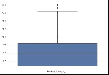
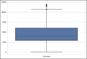
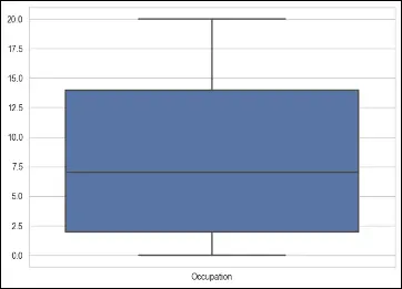
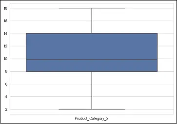
To deal with outliers using boxplots, one approach is to identify and remove the outliers based on predetermined thresholds. This can be done by considering values that fall below the lower whisker or above the upper whisker as outliers. Alternatively, instead of removing outliers, they can be treated or transformed using techniques such as winsorization (replacing extreme values with a specified percentile value) or logarithmic transformations.
In the provided code, a boxplot is created for each numerical column (‘Purchase’, ‘Product_Category_1’, ‘Product_Category_2’, ‘Occupation’) using seaborn’s boxplot function. This allows visual identification of any outliers present in the data for these specific columns.
Convert Categorical and Range Variables to Integers
Categorical variables are variables that represent qualitative attributes or characteristics. They take on a limited number of distinct categories or levels. Examples of categorical variables include gender, occupation, and city category.
Range variables, also known as continuous variables, represent quantitative attributes that can take on any value within a certain range. Examples of range variables include age, income, and purchase amount.
Converting categorical and range variables to integers is important for several reasons:
-
Numerical representation: Many machine learning algorithms and statistical models require numerical input. By converting categorical and range variables to integers, we can ensure that the data can be processed and analyzed correctly.
-
Simplification of calculations: Numeric representation simplifies calculations and computations. It allows for arithmetic operations and comparisons, which are essential in various statistical analyses and modeling techniques.
-
Standardization and scaling: Converting variables to integers can help standardize and scale the data. This is particularly important when using certain algorithms that are sensitive to the scale of the input features. Standardization can improve the performance and stability of these algorithms.
-
Encoding categorical variables: Converting categorical variables to integers allows us to apply encoding techniques such as one-hot encoding or label encoding.
CODE
print(sales_df['Stay_In_Current_City_Years'].value_counts())
print(sales_df['City_Category'].value_counts())
print(sales_df['Age'].value_counts())
print(sales_df['Gender'])
OUTPUT
1 193821
2 101838
3 95285
4+ 84726
0 74398
Name: Stay_In_Current_City_Years, dtype: int64
B 231173
C 171175
A 147720
Name: City_Category, dtype: int64
26-35 219587
36-45 110013
18-25 99660
46-50 45701
51-55 38501
55+ 21504
0-17 15102
Name: Age, dtype: int64
0 F
1 F
2 F
3 F
4 M
..
550063 M
550064 F
550065 F
550066 F
550067 F
Name: Gender, Length: 550068, dtype: object
CODE
# Group by Product_Category_1 and calculate the mean purchase price
product_category_1_mean = sales_df[['Product_Category_1', 'Purchase']].groupby(['Product_Category_1'], as_index=False).mean().sort_values(by='Purchase', ascending=False)
product_category_1_mean.columns = ['Product_Category_1', 'Mean_Purchase_Price']
product_category_1_mean['Mean_Purchase_Price'] = product_category_1_mean['Mean_Purchase_Price'].map('{:.2f}'.format)

# Group by Product_Category_2 and calculate the mean purchase price
product_category_2_mean = sales_df[['Product_Category_2', 'Purchase']].groupby(['Product_Category_2'], as_index=False).mean().sort_values(by='Purchase', ascending=False)
product_category_2_mean.columns = ['Product_Category_2', 'Mean_Purchase_Price']
product_category_2_mean['Mean_Purchase_Price'] = product_category_2_mean['Mean_Purchase_Price'].map('{:.2f}'.format)

# Display the results without indexes
with pd.option_context('display.float_format', '{:.2f}'.format):
    print(product_category_1_mean.to_string(index=False))
    print(product_category_2_mean.to_string(index=False))
OUTPUT
Product_Category_1 Mean_Purchase_Price
10 19675.57
7 16365.69
6 15838.48
9 15537.38
15 14780.45
16 14766.04
1 13606.22
14 13141.63
2 11251.94
17 10170.76
3 10096.71
8 7498.96
5 6240.09
11 4685.27
18 2972.86
4 2329.66
12 1350.86
13 722.40
20 370.48
19 37.04
Product_Category_2 Mean_Purchase_Price
10.00 15648.73
2.00 13619.36
6.00 11503.55
3.00 11235.36
15.00 10357.08
16.00 10295.68
8.00 10273.26
4.00 10215.19
13.00 9683.35
17.00 9421.58
18.00 9352.44
5.00 9027.82
11.00 8940.58
9.84 7518.70
9.00 7277.01
14.00 7105.26
12.00 6975.47
7.00 6884.68
As demonstrated, we are performing grouping and aggregation operation on the sales data.
- For Product_Category_1, we group the data by this category and calculate the mean purchase price for each category. The results are sorted in descending order of purchase price.
- Similarly, for Product_Category_2, we group the data by this category and calculate the mean purchase price for each category. The results are also sorted in descending order of purchase price.
- The results are displayed without indexes, and the mean purchase prices are formatted to two decimal places for better readability.
Purchase Distribution and Correlation Matrix
The correlation coefficients between several variables are displayed in a table called a correlation matrix. It serves as a gauge for the strength and direction of a linear relationship between two variables.Each cell in the matrix represents the correlation coefficient between two variables, ranging from -1 to 1. A positive value indicates a positive correlation, meaning that as one variable increases, the other variable tends to increase as well. A negative value indicates a negative correlation, meaning that as one variable increases, the other variable tends to decrease. A value close to 0 indicates a weak or no correlation between the variables.
Analyzing the correlation matrix is important because it provides insights into the relationships between variables. It helps in understanding how different features or variables are related to each other and to the target variable. By identifying strong correlations, we can determine which variables have a significant impact on the target variable and may be important for prediction or modeling purposes. Correlation analysis also helps in feature selection, as highly correlated variables may provide redundant information and can be eliminated to simplify the model and improve interpretability.
In machine learning models, correlation analysis helps in several ways:
-
Feature Selection: Highly correlated features can be removed to avoid multicollinearity, where multiple variables provide similar information, leading to unstable and less interpretable models.
-
Feature Engineering: By analyzing correlations, new features can be created by combining or transforming existing features, which can improve the predictive power of the model.
-
Model Interpretation: Understanding the correlation between variables helps in interpreting the model’s coefficients and understanding the direction and strength of the relationships between features and the target variable.
CODE
# plot the correlation matrix as a heatmap

plt.figure(figsize=(10, 10))
sns.heatmap(matrix, vmax=1, square=True, cmap='BuPu', annot=True)
plt.title('Correlation between different features')
plt.show()
OUTPUT
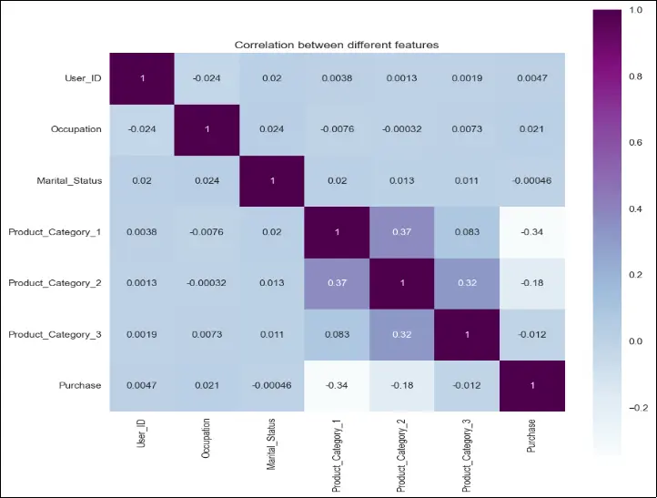
Based on the correlation heatmap, we can observe that certain variables have a stronger correlation with the “Purchase” column. The variables “User_ID,” “Marital Status,” and “Product_Category_3” show relatively weak correlation with the purchase power of the customer. Conversely, the variables “Occupation,” “Product Category 1,” and “Product Category 2” exhibit a significantly higher impact on the purchase behavior. It’s important to note that this correlation analysis is based on numerical fields only, and we will be generating an even more insightful heatmap right before preparing the ML model.
Data Visualization
The graphical depiction of data using graphs, charts, and other visual components is known as data visualisation and it is a way to visually explore and communicate patterns, relationships, and trends within the data.
By plotting different variables against the “Purchase” variable, trends can be identified through visual analysis.
CODE
# Check the purchase distribution with respect to Gender
purchase_gender = sales_df.groupby['Gender']('Purchase').sum() / 1000000

# Rename 0 and 1 to Female and Male
purchase_gender.index = ['Female', 'Male']

# Plot the purchase distribution by Gender
plt.bar(purchase_gender.index, purchase_gender, color=['#F8766D', '#00BFC4'] )

# Add a title
plt.title('Purchase Distribution by Gender')

# Customize the x-axis and y-axis labels
plt.xlabel('Gender')
plt.ylabel('Purchase (in millions)')

# Display the plot
plt.show()
OUTPUT
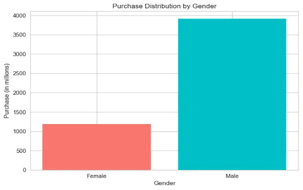
Based on the data provided in train.csv, males have purchased significantly more than females, almost 3x more. This would lead us to the conclusion that either the data set is skewed, or men are willing to spend much more on products by company ABC. This also speaks about purchase power parity.
CODE
# Check the purchase distribution with respect to Age
purchase_age = sales_df.groupby['Age']('Purchase').sum() / 1000000

# Assign the modified age labels as the index
purchase_age.index = ['0-17', '18-25', '26-35', '36-45', '46-50', '51-55', '55+']

# Plot the purchase distribution by Age
plt.bar(purchase_age.index, purchase_age, color=['#4C72B0', '#55A868', '#C44E52', '#8172B2', '#CCB974', '#64B5CD', '#4C4C4C'])

# Add a title
plt.title('Purchase Distribution by Age')

# Customize the x-axis and y-axis labels
plt.xlabel('Age')
plt.ylabel('Purchase (in millions)')

# Display the plot
plt.show()
OUTPUT
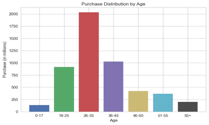
Again, this graph makes sense since most of the audience is represented by the centre curve, which gives the appearance of a normal curve. Most of the audience is between the ages of 26 and 35, while young people and the elderly have the lowest levels of purchasing power.
CODE
# Check the purchase distribution with respect to City_Category

purchase_city = sales_df.groupby['City_Category']('Purchase').sum() / 1000000
purchase_city.index = ['A', 'B', 'C']

# Plot the purchase distribution by City Category as a pie chart

plt.pie(purchase_city, labels=purchase_city.index, autopct='%1.1f%%', startangle=90, colors= ['#4C72B0', '#55A868', '#C44E52'])

# Add a title

plt.title('Purchase Distribution by City Category')

# Add a circle at the center of the pie to make it donut-like
circle = plt.Circle((0, 0), 0.10, fc='white')
plt.gca().add_artist(circle)
plt.axis('equal')

# Display the plot
plt.show()
OUTPUT
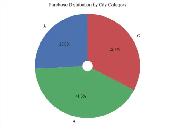
We can determine the percentage distribution of the city category by plotting a pie chart, and this helps us conclude that people from category B cities have the greatest purchasing power and willingness to spend, while category A cities have the fewest purchases made—nearly 1.8 times fewer than city type B.
CODE
# Check the purchase distribution with respect to Occupation

purchase_occupation = sales_df.groupby['Occupation']('Purchase').sum() / 1000000

# Bar plot
plt.bar(purchase_occupation.index, purchase_occupation.values, color='#4C72B0', edgecolor='black')

# Set labels and title
plt.title('Purchase Distribution by Occupation')
plt.xlabel('Occupation Category')
plt.ylabel('Purchase (in millions)')

# Add data labels on top of the bars
for i, value **in** enumerate(purchase_occupation.values):
    plt.text(i, value + 0.2, f'{value:.2f}', ha='center')

# Add a background color to the plot
plt.gca().set_facecolor('#F5F5F5')

# Adjust spacing
plt.tight_layout()

# Display the plot
plt.show()
OUTPUT
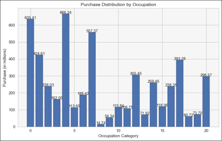
As various employment categories pay varying incomes, it stands to reason that category 0, 4, and 7 occupations may potentially have the greatest earnings, which would therefore likely result in more expenditure on goods and services.
But the lowest purchase amounts are made by jobs in categories 8, 9, and 18.
This may be because individuals in these jobs don’t require the items made by business ABC, or it may be because of the extremely low earnings in the industrial sector.
CODE
# Check the purchase distribution with respect to Stay_In_Current_City_Years
purchase_stay = sales_df.groupby['Stay_In_Current_City_Years']('Purchase').sum() / 1000000

# Bar plot
plt.bar(purchase_stay.index, purchase_stay.values, color='#8B008B', edgecolor='black')

# Set labels and title
plt.title('Purchase Distribution by Stay in Current City Years')
plt.xlabel('Years stayed in Current City')
plt.ylabel('Purchase (in millions)')

# Add data labels on top of the bars
**for** i, value **in** enumerate(purchase_stay.values):
``plt.text(i, value + 0.2, f'{value:.2f}', ha='center')

plt.gca().set_facecolor('#F5F5F5')
plt.tight_layout()

# Display the plot
plt.show()
OUTPUT
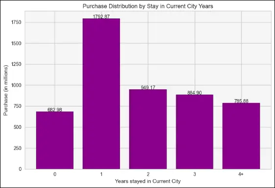
This bar graph reflects the needs of newcomers to the city who require products and services to establish themselves. As a result, those who have been in the city for a year have made the most purchases, which quickly decline as they continue to live there.
CODE
# check the purchase distribution with respect to Marital_Status

purchase_marital = sales_df.groupby['Marital_Status']('Purchase').sum() / 1000000

# Map values of Marital_Status to corresponding labels
purchase_marital.index = ['Unmarried', 'Married']

# Bar plot
plt.bar(purchase_marital.index, purchase_marital.values, color=['#6495ED', '#FFA07A'] , edgecolor='black')

# Set labels and title
plt.title('Purchase Distribution by Marital Status')
plt.xlabel('Marital Status')
plt.ylabel('Purchase (in millions)')

# Add data labels on top of the bars
for i, value **in** enumerate(purchase_marital.values):
``plt.text(i, value + 0.2, f'{value:.2f}', ha='center')

# Add a background color to the plot
plt.gca().set_facecolor('#F5F5F5')

# Adjust spacing
plt.tight_layout()

# Display the plot
plt.show()
OUTPUT
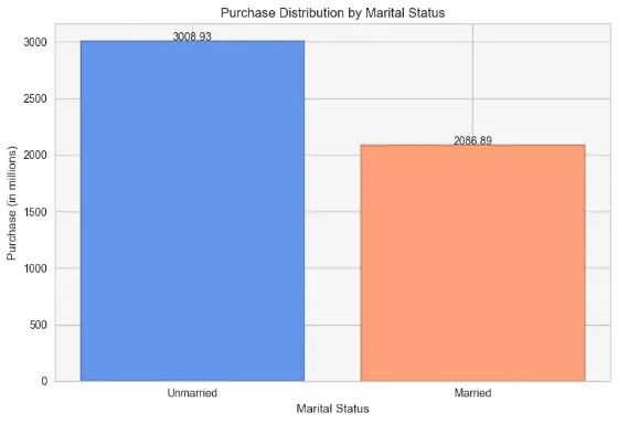
When contrasted to married people, the bias obviously favours single people, probably because of the costs associated with education, travel, and other products and services. Nonetheless, because of financial considerations like family planning and long-term savings, married people may tend to spend less.
A scatter plot is a type of data visualization that represents the relationship between two variables. It displays individual data points as dots on a two-dimensional graph, with one variable plotted along the x-axis and the other variable plotted along the y-axis. Scatter plots are useful for visualizing the correlation or relationship between two continuous variables.
To see the relationship between product category 1 (categorical) and purchase using a scatter plot, we need to convert the categorical variable into a numerical representation. One way to achieve this is by assigning a numeric code to each category. For example, we can map ‘Product_Category_1’ values like ‘Category A’ to 1, ‘Category B’ to 2, and so on.
CODE
# Scatter plot
plt.scatter(sales_df['Product_Category_1'], sales_df['Purchase'], color='#8A2BE2', edgecolors='black')

# Set labels and title
plt.xlabel('Product Category 1')
plt.ylabel('Purchase')
plt.title('Relationship between Purchase and Product Category 1')

# Add gridlines
plt.grid(True, linestyle='--', linewidth=0.5, alpha=0.7)

# Add transparency to the scatter points
plt.scatter(sales_df['Product_Category_1'], sales_df['Purchase'], color='#8A2BE2',** edgecolors='black', alpha=0.5)

plt.legend(['Data Points'])
plt.gca().set_facecolor('#F5F5F5')
plt.tight_layout()

# Display the plot
plt.show()
OUTPUT
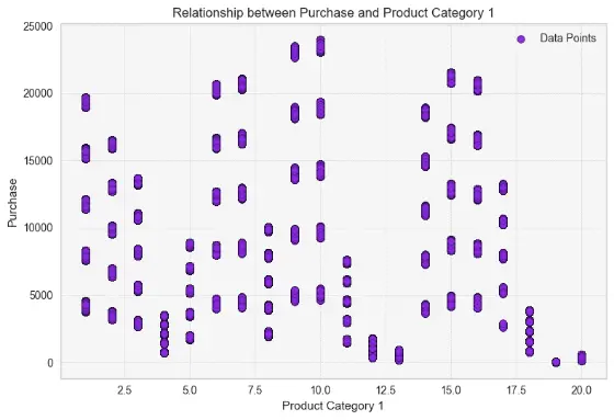
As seen above, product categories 4, 13, 19 and 20 have products which are not priced more than 5000 hence these product categories, although numerous will generate the least revenue. On the other hand, product categories 9, 10, 6, and 7 have items with prices that typically start at or exceed 5,000 and can even reach 20,000 or 25,000, generating more revenue for the business. You can also probabilisticlaly determine the name of these categories from the price ranges. Most other categories are somewhere in between.
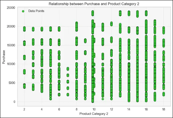
CODE
# Scatter plot
plt.scatter(sales_df['Product_Category_2'], sales_df['Purchase'], color='#32CD32' , edgecolors='black')

# Set labels and title
plt.xlabel('Product Category 2')
plt.ylabel('Purchase')
plt.title('Relationship between Purchase and Product Category 2')

# Add gridlines
plt.grid(True, linestyle='--', linewidth=0.5, alpha=0.7)

# Add transparency to the scatter points
plt.scatter(sales_df['Product_Category_2'], sales_df['Purchase'], color='#32CD32' , edgecolors='black', alpha=0.5)

# Add a legend
plt.legend(['Data Points'])
plt.gca().set_facecolor('#F5F5F5')
plt.tight_layout()

# Display the plot
plt.show()
OUTPUT
CODE
# Plot the most frequently bought products
plt.figure(figsize=(10, 5))
plt.bar(top_frequently_bought.index, top_frequently_bought.values, color='#4287f5', edgecolor='black')
plt.title('Most Frequently Bought Products')
plt.xlabel('Product ID')
plt.ylabel('Purchase Count')
plt.xticks(rotation=90)
plt.tight_layout()  # Adjust spacing
plt.show()

# Plot the products that generated the most revenue
plt.figure(figsize=(10, 5))
plt.bar(top_revenue_products.index, top_revenue_products.values/1000000, color='#4287f5', edgecolor='black')
plt.title('Products with the Most Revenue')
plt.xlabel('Product ID')
plt.ylabel('Revenue (in millions)')
plt.xticks(rotation=90)
plt.tight_layout()  # Adjust spacing
plt.show()
OUTPUT
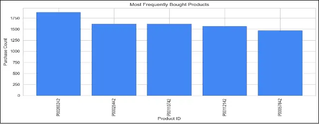
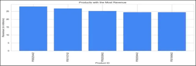
This code is plotting two bar charts. The first chart shows the most frequently bought products, displaying the purchase count for each product. The second chart displays the products that generated the most revenue, showing the revenue (in millions) for each product.
These visualizations provide valuable insights into the popular products and their revenue contribution, which can help identify best-selling items and inform business decisions related to inventory management, marketing strategies, and product promotions. This will prove beneficial for the company to analyze their sales data and identify which products are most popular among their customers.
Label Encoding and Feature Selection
From this section we will be cleaning up the dataset and picking the features and the target for our Machine Learning model. But before moving on, let us describe a few terms.
Label encoding is a process of converting categorical variables into numerical format. It assigns a unique numeric label to each category within a variable. This encoding is useful when working with machine learning algorithms that require numerical inputs.
Feature selection is the process of selecting a subset of relevant features (variables) from the available dataset that are most predictive or informative for the target variable. It helps to improve model performance, reduce overfitting, and enhance interpretability.
In machine learning models, the “target” refers to the variable that the model aims to predict or estimate. It is also known as the dependent variable or the output variable. The target variable represents the outcome or the value we want to predict based on the input features (independent variables) in the model. The model learns patterns and relationships in the input features to make predictions or classifications for the target variable.
The steps involved in making a robust ML model are:
To set up your machine learning algorithm for predicting the values of the “purchase” column based on the given train.csv and test.csv datasets, you can follow these steps:
Data Preprocessing
- Load the train.csv dataset and perform necessary data cleaning and preprocessing steps such as handling missing values, encoding categorical variables, and splitting the data into features (X_train) and target (y_train).
- Similarly, preprocess the test.csv dataset, ensuring that it undergoes the same preprocessing steps as the training data. However, since the “purchase” column is missing in the test dataset, you can exclude it from the features (X_test) and treat it as the target variable that you want to predict.
Feature Selection and Engineering:
- Based on the analysis of the data and any available correlation insights, select the relevant features that have a strong impact on the target variable.
- Perform any feature engineering techniques such as creating new features, scaling/normalizing the data, or transforming variables if necessary. Ensure that these steps are consistently applied to both the training and test datasets.
Model Selection and Training:
- Choose an appropriate machine learning algorithm for regression, such as Linear Regression, Random Forest Regression, or Gradient Boosting Regression.
- Split the preprocessed training data (X_train and y_train) into training and validation sets.
- Train your chosen model on the training data and tune hyperparameters if necessary, using techniques like cross-validation and grid search.
Model Evaluation:
- Evaluate the performance of your trained model on the validation set using appropriate evaluation metrics such as mean squared error (MSE), root mean squared error (RMSE), or R-squared. This will give you an idea of how well your model is performing.
Model Prediction:
- Once you are satisfied with the model’s performance, use it to predict the “purchase” values for the preprocessed test dataset (X_test) that does not have the “purchase” column.
- The predicted values will serve as the predicted purchase amounts for each customer and product combination in the test dataset.
CODE
with open('test.csv' , 'r') as f:
    test = pd.read_csv(f)

# Instantiate the LabelEncoder
le = LabelEncoder()

train_ml = sales_df.copy()
test_ml = test.copy()

train_ml['User_ID']=le.fit_transform(train_ml['User_ID'])
test_ml['User_ID']=le.fit_transform(test_ml['User_ID'])

train_ml['Product_ID']=le.fit_transform(train_ml['Product_ID'])
test_ml['Product_ID']=le.fit_transform(test_ml['Product_ID'])

train_ml['Age']=train_ml['Age'].map({'0-17':17,'55+':60,'26-35':35, '46-50':50,'51-55':55,'36-45':45,'18-25':25})

test_ml['Age']=test_ml['Age'].map({'0-17':17,'55+':60,'26-35':35,'46-50':50,'51-55':55,'36-45':45,'18-25':25})

train_ml['Stay_In_Current_City_Years']=train_ml['Stay_In_Current_City_Years'].map({'2':2,'4+':4,
'3':3,'1':1,'0':0})

test_ml['Stay_In_Current_City_Years']=test_ml['Stay_In_Current_City_Years'].map({'2':2,'4+':4,
'3':3,'1':1,'0':0})

category_train_ml=train_ml.select_dtypes(include=[object]).columns
le=LabelEncoder()
for col in category_train_ml:
    train_ml[col]=le.fit_transform(train_ml[col])

categorical_test_ml=test_ml.select_dtypes(include=[object]).columns
for cols in categorical_test_ml:
    test_ml[cols]=le.fit_transform(test_ml[cols])

train_ml.tail()
OUTPUT
User_ID Product_ID Gender Age Occupation City_Category
550063 5883 3567 1 55 13 1
550064 5885 3568 0 35 1 2
550065 5886 3568 0 35 15 1
550066 5888 3568 0 60 1 2
550067 5889 3566 0 50 0 1
Stay_In_Current_City_Years Marital_Status Product_Category_1
550063 1 1 20
550064 3 0 20
550065 4 1 20
550066 2 0 20
550067 4 1 20
Product_Category_2 Product_Category_3 Purchase
550063 9.842329 12.668243 368
550064 9.842329 12.668243 371
550065 9.842329 12.668243 137
550066 9.842329 12.668243 365
550067 9.842329 12.668243 490
Here’s what we did above, as you can guess from the output.
- The test.csv file is being read using pandas’ read_csv function and stored in a variable called test. Previously we worked only with train.csv but since we are now building the actual ML model, we will need the test data set as well.
- An instance of the LabelEncoder class is being created and stored in a variable called le.
- The sales_df dataframe is being copied into two new dataframes called train_ml and test_ml.
- The User_ID and Product_ID columns of both train_ml and test_ml is being encoded using the fit_transform method of le.
- The Age column of both train_ml and test_ml is being mapped to new values using a dictionary.
- The Stay_In_Current_City_Years column of both train_ml and test_ml is being mapped to new values using a dictionary.
- All categorical columns of train_ml is being encoded using the fit_transform method of le.
- All categorical columns of test_ml is being encoded using the fit_transform method of le.
To improve Feature Selection, the following steps will prove beneficial.
- Load and preprocess your dataset.
- Split the dataset into input features (X) and the target variable (y).
- Import the necessary libraries for feature selection.
- Apply one or more feature selection techniques to evaluate the importance of each feature.
- Select the top k features based on their importance scores or other criteria.
- Subset your dataset to include only the selected features.
- Train your model using the subset of selected features.
- Evaluate the performance of your model using appropriate metrics.
Improving feature selection involves identifying the most relevant and informative features for your prediction task. Here are some approaches to improve feature selection:
-
Univariate Feature Selection: Use statistical tests or metrics to evaluate the relationship between each feature and the target variable independently. Select the features with the highest scores or p-values as the most relevant.
-
Recursive Feature Elimination: Train a model using all features and recursively eliminate the least important features based on their coefficients or feature importances. This iterative process helps identify the subset of features that contribute the most to the model’s performance.
-
Feature Importance from Tree-based Models: Train tree-based models such as Random Forest or XGBoost and extract the feature importances. Select the features with the highest importances as they have a greater impact on the model’s predictions.
-
Regularization Techniques: Use regularization techniques like L1 (Lasso) or L2 (Ridge) regularization to penalize less important features and encourage sparsity. These techniques can help automatically select the most informative features.
-
Domain Knowledge and Feature Engineering: Leverage your domain knowledge to engineer new features or transform existing ones that may provide more relevant information for the prediction task. Feature engineering can significantly improve the performance of your model.
-
Dimensionality Reduction Techniques: Apply dimensionality reduction techniques like Principal Component Analysis (PCA) or Singular Value Decomposition (SVD) to reduce the dimensionality of the feature space while retaining most of the important information. This can help eliminate redundant or less informative features.
-
Regular Monitoring and Iterative Improvement: Continuously monitor the performance of your model and iterate on feature selection. Experiment with different combinations of features, feature transformations, and feature engineering techniques to find the most effective set of features.
Building the ML Model
After completing the data preprocessing, analysis, visualization, and label encoding, we are now ready to build a machine learning model to predict the “Purchase” value for company ABC. In this case, we are dealing with a regression problem since we want to estimate a continuous numerical value.
Among the various regression models available, one of the top models provided by the scikit-learn library is the Linear Regression model. Linear Regression is a popular and widely used regression technique that assumes a linear relationship between the input features and the target variable. It aims to find the best-fit line that minimizes the difference between the actual and predicted values.
The Linear Regression model in scikit-learn provides various functionalities, including:
- Handling multiple input features and calculating their coefficients.
- Performing feature scaling to standardize the input features.
- Handling categorical variables using techniques like one-hot encoding or label encoding.
- Evaluating the model’s performance using various metrics such as mean squared error (MSE), root mean squared error (RMSE), mean absolute error (MAE), and coefficient of determination (R-squared). These metrics help us assess how well the model fits the data and how accurate its predictions are.
To select the best regression model for our task, we will train and evaluate multiple regression models, such as Linear Regression, Decision Tree Regression, Random Forest Regression, and XGBoost Regression and evaluate their performance to see which yields the highest accuracy.
Before moving on to the coding phase, let us first identify the metrics to identify the best performing model.
- R2 score, also known as the coefficient of determination, measures the proportion of the variance in the target variable that can be explained by the model. It indicates how well the model fits the data, with a higher value indicating a better fit.
- MSE calculates the average squared difference between the actual and predicted values, while RMSE is the square root of MSE, providing a more interpretable metric in the original unit of the target variable.
- Lower MSE and RMSE values indicate better accuracy and less error in the predictions.
LINEAR REGRESSION
It is a simple and widely used regression algorithm that assumes a linear relationship between the input features and the target variable. It calculates the coefficients for each feature to fit a best-fit line to the data. It is easy to interpret and provides insights into the impact of each feature on the target variable.
CODE
x= train_ml.drop(['Purchase'],axis=1)
y= train_ml['Purchase']
test_x=test_ml
train_x,val_x,train_y,val_y=train_test_split(x,y,test_size=0.2,random_state=42,shuffle=True)
# LINEAR REGRESSION
lr=LinearRegression()
lr_model=lr.fit(train_x,train_y)
pred_lr=lr_model.predict(val_x)
mse = mean_squared_error(pred_lr, val_y)
print("Linear REG Mean Square Error: ", mse)
rmse_lr = np.sqrt(mean_squared_error(val_y, pred_lr))
print("Linear REG Root Mean Square Error: ", rmse_lr)
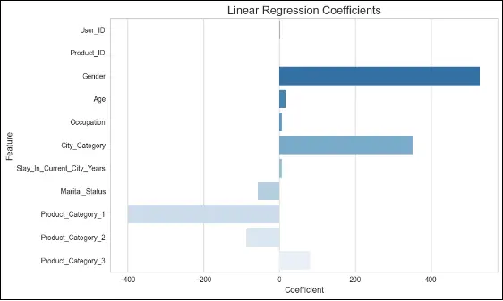
features_lr = x.columns
coeff_lr = lr_model.coef_
coefficients_lr = pd.Series(lr_model.coef_, features_lr)
plt.figure(figsize=(10, 6))
sns.barplot(x=coeff_lr, y=features_lr, palette="Blues_r")
plt.title("Linear Regression Coefficients", fontsize=16)
plt.xlabel("Coefficient", fontsize=12)
plt.ylabel("Feature", fontsize=12)
plt.xticks(fontsize=10)
plt.yticks(fontsize=10)
plt.tight_layout()
plt.show()
OUTPUT
Linear REG Mean Square Error: 21708175.443769183
Linear REG Root Mean Square Error: 4659.203305691777
XGBOOST REGRESSION
It is an optimized gradient boosting framework that excels in handling structured data. It is an ensemble model that combines multiple weak learners (decision trees) to make accurate predictions. XGBoost Regression is specifically designed for regression tasks and provides excellent performance and flexibility. It handles missing values, supports regularization techniques, and offers advanced features like early stopping to prevent overfitting.
CODE
# XGBOOST REGRESSOR
XGBoost_Regression = XGBRegressor(learning_rate=1.0, max_depth=6, min_child_weight=40, seed=0)
XGBoost_Regression.fit(train_x, train_y)
pred_xgb = XGBoost_Regression.predict(val_x)
rmse_xgb = np.sqrt(mean_squared_error(pred_xgb, val_y))
print("RMSE for XGBoost Regressor:", rmse_xgb)
OUTPUT
RMSE for XGBoost Regressor: 2591.1169777068635
In the context of XGBoost, n_estimators is a hyperparameter that represents the number of decision trees to be built in the XGBoost ensemble. Each decision tree is trained sequentially, and the final prediction is obtained by aggregating the predictions of all the trees.
Increasing the value of n_estimators can improve the model’s performance up to a certain point. More trees allow the model to capture more complex patterns and relationships in the data, potentially leading to better predictive performance. However, using a very large value for n_estimators can also increase the risk of overfitting the training data and may result in longer training times.
It is common to tune the n_estimators hyperparameter during the model selection and evaluation process. This can be done using techniques such as cross-validation or grid search, where different values of n_estimators are tested to find the optimal value that balances model performance and computational efficiency. We are setting n_estimators=100 means that the XGBoost model will be trained using 100 decision trees in the ensemble.
RANDOM FOREST REGRESSION
Random Forest Regression is an ensemble model that builds a multitude of decision trees and combines their predictions to obtain a more accurate and robust result. It addresses overfitting and is effective in handling high-dimensional datasets. It provides feature importance scores to identify the most influential features.
CODE
# RANDOM FOREST REGRESSOR
RandomForest_reg=RandomForestRegressor(max_depth=2, random_state=0)
RandomForest_reg.fit(train_x,train_y)
RandomForest_reg=RandomForest_reg.predict(val_x)
rmse=np.sqrt(mean_squared_error(RandomForest_reg,val_y))
print("RMSE for Random Forest:",rmse)
OUTPUT
RMSE for Random Forest: 4163.747031944405
ADA BOOST REGRESSION
AdaBoost Regression is an ensemble model that iteratively improves performance by focusing on the previously misclassified instances. It combines weak learners to create a strong learner, making it suitable for regression tasks. It adapts to the data and assigns higher weights to harder-to-predict instances.
CODE
# ADA BOOST REGRESSOR
ADBBoost_Regression=AdaBoostRegressor(n_estimators=100,random_state=0)
ADBBoost_Regression.fit(train_x,train_y)
pred_adb=ADBBoost_Regression.predict(val_x)
rmse=np.sqrt(mean_squared_error(pred_adb,val_y))
print("RMSE for Adaboost Regressor:",rmse)
OUTPUT
RMSE for Adaboost Regressor: 3595.007906514239
GRADIENT BOOST REGRESSION
Gradient Boosting Regression is another ensemble technique that combines weak learners (decision trees) in a sequential manner. It optimizes a loss function by fitting the subsequent models to the residual errors of the previous models. It is a powerful algorithm that achieves high accuracy by minimizing the loss iteratively.
CODE
# GRADIENT BOOSTING REGRESSOR
GradientBoosting_Regression=GradientBoostingRegressor(n_estimators=100, learning_rate=1.0, random_state=0)
GradientBoosting_Regression.fit(train_x,train_y)
GradientBoostingRegressor(learning_rate=1.0, random_state=0)
gbr_predicition=GradientBoosting_Regression.predict(val_x)
rmse=np.sqrt(mean_squared_error(gbr_predicition,val_y))
print("RMSE for Gradient Boosting Regressor:",rmse)
OUTPUT
RMSE for Gradient Boosting Regressor: 2756.5231625627925
CODE
RMSE for Gradient Boosting Regressor: 2756.5231625627925

from sklearn.metrics import r2_score
r2 = r2_score(val_y, gbr_predicition)
print("R2 Score for Gradient Boosting Regressor:", r2)
OUTPUT
R2 Score for Gradient Boosting Regressor: 0.6975895276400425
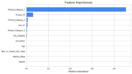
Feature Importance is a technique used to determine the relevance or contribution of each feature in the prediction task. It helps identify the columns that are most useful in predicting the target variable. Techniques like permutation importance, Gini importance, or feature importance scores provided by ensemble models like Random Forest or XGBoost library.
CODE
# Plot the feature importance
features = x.columns
importances = GradientBoosting_Regression.feature_importances_
indices = np.argsort(importances)

plt.figure(figsize=(10, 6))
plt.title('Feature Importances', fontsize=16)
plt.barh(range(len(indices)), importances[indices], color='#4287f5', edgecolor='black')
plt.yticks(range(len(indices)), [features[i] **for** i **in** indices], fontsize=10)
plt.xlabel('Relative Importance', fontsize=12)
plt.show()
OUTPUT
You can explore other popular and well-known regression techniques to boost accuracy even more. Just note that these are CPU-intensive and training time can go from several minutes to several hours depending on the scale of the dataset.
-
Support Vector Regression (SVR): SVR is a powerful algorithm for regression tasks that can handle both linear and non-linear relationships. It uses support vectors to capture the important patterns in the data.
-
Neural Networks: Deep learning models, such as Multilayer Perceptron (MLP) or Recurrent Neural Networks (RNN), can be effective for regression tasks when you have large amounts of data and complex relationships.
-
Ridge Regression: Ridge regression is a linear regression technique that incorporates regularization to prevent overfitting and handle multicollinearity. It can be useful when you have many features.
To improve the model’s performance, you can try the following techniques:
- Feature Engineering: Create new features or transform existing features to provide more meaningful information to the model. For example, you could combine related features, create interaction terms, or apply mathematical transformations to certain variables.
- Include More Relevant Features: Explore other features that may have a significant impact on the target variable. Consider adding additional features based on domain knowledge or further analysis of the data.
- Remove Irrelevant Features: Identify and remove features that do not contribute much to the prediction task. These features may have low correlation with the target variable or exhibit multicollinearity with other features.
- Polynomial Regression: Consider using polynomial regression to capture non-linear relationships between the features and the target variable. This can be achieved by creating polynomial features or using polynomial regression algorithms.
- Regularization Techniques: Apply regularization techniques like Ridge Regression or Lasso Regression to prevent overfitting and improve the model’s generalization ability. Regularization helps in reducing the impact of irrelevant or noisy features.
- Ensemble Methods: Explore ensemble methods such as Random Forests or Gradient Boosting. These techniques combine multiple models to make more accurate predictions and can handle complex relationships between features and the target variable.
- Hyperparameter Tuning: Optimize the hyperparameters of your chosen algorithm using techniques like grid search or random search. This involves systematically trying different combinations of hyperparameter values to find the best configuration for your model.
- Cross-Validation: Use cross-validation techniques to better estimate the model’s performance and reduce overfitting. This helps ensure that the model’s performance is not dependent on a specific train-test split.
- Collect More Data: If possible, collect more data to increase the diversity and quantity of samples available for training. More data can often improve the model’s accuracy and generalization.
Making the Actual Predictions
CODE
# save the model to disk
import pickle
filename = 'finalized_model.sav'
pickle.dump(GradientBoosting_Regression, open(filename, 'wb'))

# load the model from disk
with open('finalized_model.sav', 'rb') as file:
``ML_MODEL = pickle.load(file)

print(ML_MODEL)
OUTPUT
GradientBoostingRegressor(learning_rate=1.0, random_state=0)
CODE
XGBoost_Regression.fit(x, y)
predict_final = XGBoost_Regression.predict(test_x)

# make a predictions dataframe
predictions = pd.DataFrame()

predictions['Purchase'] = predict_final
predictions.to_csv('sales_prediction.csv', index=False)
OUTPUT
| Purchase |
|---|
| 12624.37 |
| 13786.86 |
| 3508.918 |
The sales prediction CSV has the above format. To examine the projected output for each user, copy and paste this column into the original train.csv and test.csv files. The rows are in the same order as they were in the original files.
Conclusion
This exercise explored the analysis of customer purchasing habits and predicting their spending on products. By understanding customer behavior and preferences, businesses can offer personalized offers and improve their customer targeting strategies.
Let’s recap the sales analysis and prediction:
-
Understanding customer purchasing habits and analyzing customer behavior is essential for businesses to personalize their offerings and enhance customer satisfaction. Through data preprocessing and exploratory data analysis, you gained valuable insights into the dataset, uncovering patterns and relationships.
-
Addressing outliers and visualizing the data through various techniques provided further understanding of the purchasing patterns and correlations between variables. Label encoding and feature selection helped prepare the data for model building by selecting relevant features that contribute to predicting customer spending.
-
Implementing regression models such as Linear Regression, XGBoost Regression, RandomForest Regression, ADA Boost Regression, and Gradient Boost Regression allowed you to leverage customer characteristics and product categories to predict spending accurately.
-
Evaluating the model’s performance using metrics like R2 score, mean square error (MSE), and root mean square error (RMSE) revealed the accuracy and effectiveness of the models. The Gradient Boost Regression model achieved an R2 score of approximately 0.70, indicating that around 70% of the variation in customer spending was explained by the model.
In conclusion, by analyzing customer purchasing habits and building predictive models, you gained valuable insights for tailored marketing strategies and business decision-making. Continuous refinement and improvement of the models, along with techniques like feature engineering, hyperparameter tuning, ensemble methods, cross-validation, and handling imbalanced data, can further enhance the accuracy and performance of the models. These insights and models contribute to maximizing customer satisfaction, optimizing business profitability, and driving success in customer purchasing analysis.
Test your Django CRUD skills with Django Crypto App